Mobile-First Website Checklist: 12 Things to Test on Your Phone
Most of your visitors will see your website on a phone first. If it's hard to read, slow to load or the buttons are too small, they leave, often without you ever knowing. Whether your customers are in Metro Manila or abroad, good responsive web design means the site works just as well on a phone as it does on a laptop.
You don't need to be technical to check. Grab your phone and run through these 12 tests. It takes about 15 minutes.
Quick answer: On your phone, check load time, text size, tap targets, menus, forms, click-to-call, images, pop-ups, horizontal scrolling, maps, landscape view and slow mobile data. Fix anything that makes you pinch, zoom or wait.
Table of Contents
Before you start
Use your own phone, turn off Wi-Fi and use mobile data. Open the site in a private browser tab so you see what a new visitor sees.
Loading and reading (tests 1–4)
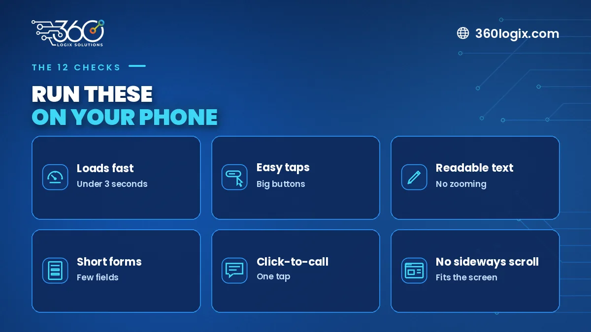
- Load time. Does the first screen appear quickly on mobile data? If you find yourself waiting, so will customers.
- Text size. Can you read body text without zooming?
- No sideways scrolling. The page should never slide left and right.
- Contrast. Light grey text on white is hard to read outdoors.
Tapping and navigating (tests 5–8)
- Tap targets. Buttons and links should be easy to hit with a thumb, with space between them.
- Menu. Does the menu open, close and show every important page?
- Click-to-call. Tap your phone number. Does your phone offer to call?
- Pop-ups. Can you close any pop-up easily? Pop-ups that cover the whole screen frustrate mobile visitors.
Forms and actions (tests 9–10)
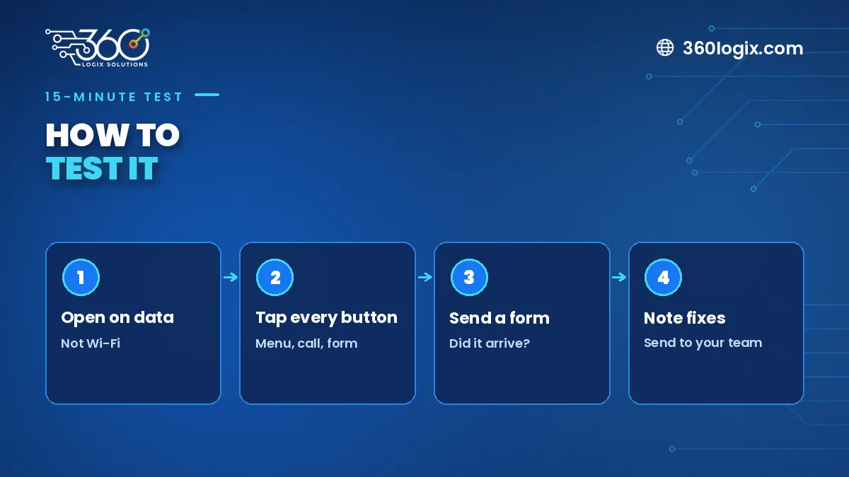
- Forms. Fill in and send your contact form. Did the right keyboard show up for email and phone fields? Did you get a confirmation?
- Maps and directions. If you list an address, does the map open in your phone's map app?
Edge cases (tests 11–12)
- Landscape view. Turn your phone sideways. Does the layout still work?
- Images and videos. Do they fit the screen and load without stalling?
What to fix first
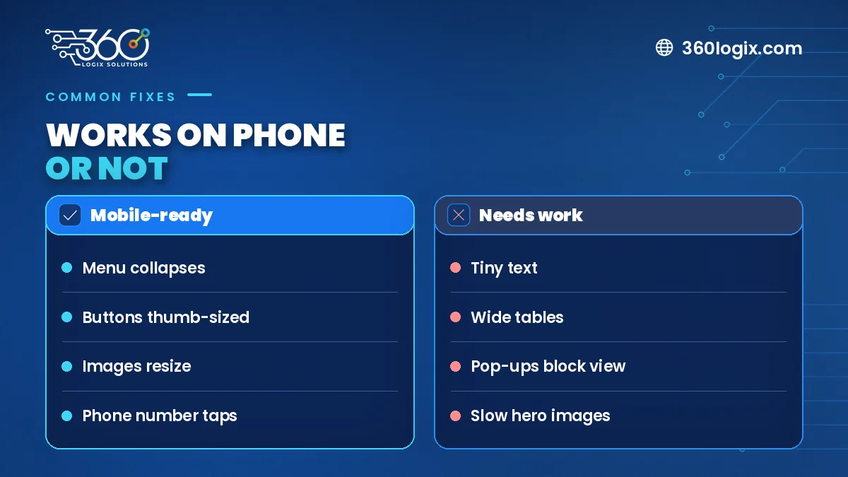
Start with anything that stops an inquiry: broken forms, missing click-to-call, or a page that won't load. Then fix slow loading and small buttons. Visual polish comes last.
If your site also gets traffic from ads, every second matters. Our digital marketing team sees this every day: a slow mobile page wastes ad spend.
FAQ
What's the difference between responsive and mobile-first?
Responsive means the layout adjusts to screen size. Mobile-first means the site is planned for phones from the start, then expanded for bigger screens.
Can an old site be made responsive?
Sometimes, but if many tests fail, a rebuild is often faster and cleaner.
How often should I run this check?
After any big change, and at least every few months.
Need a site that passes every test?
Our website development builds are tested on phones before launch and start at ₱65,000 VAT inclusive, with Full SEO setup and 1 year of free hosting.
Written by Paolo Reyes. Paolo Reyes is the CEO of 360 Logix Solutions Inc., a technology-driven marketing company with 15+ years in digital marketing, creatives, brand activations and events.
Related Articles
How to Choose a Web Design Company: 10 Questions Before You Sign
Comparing a web design company in the Philippines? Use these 10 questions on ownership, mobile, speed, SEO, timelines and support before you sign anything.
Website Development Cost in the Philippines: Packages From ₱65,000
Website development cost in the Philippines: what our package, starting at ₱65,000 VAT inclusive, covers, with Full SEO setup and 1 year free hosting.

What Pages Does a Small Business Website Really Need?
Planning a website for small business? Here are the pages you actually need, what goes on each one, and what you can safely skip until after launch day.