The Psychology of Conversion: How UX Design Impacts Marketing ROI
The design of your website is not just an aesthetic choice; it is a psychological framework that dictates whether a visitor buys or bounces. You can spend millions of pesos driving highly targeted traffic to your landing pages, but if the user experience (UX) is fraught with friction, that marketing budget is completely wasted. Understanding the psychology of conversion is the bridge between attracting attention and actually generating revenue.
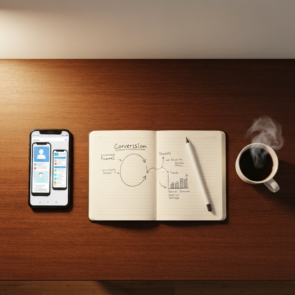
Many business owners treat web design and digital marketing as two completely separate disciplines. Marketing is viewed as the engine that brings people to the store, while design is seen as the paint on the walls. This is a fatal misconception. In the digital landscape, the design is the store. It is the salesperson, the cashier, and the customer service representative all rolled into one.
When a potential customer lands on your site, they are making subconscious calculations within milliseconds. They are evaluating trust, clarity, and ease of use. If your website forces them to think too hard, wait too long, or search too deeply for the information they need, their brain will naturally choose the path of least resistance: hitting the back button and visiting your competitor.
Key Takeaways
- Cognitive load kills conversions; your website must tell the user exactly what to do next without making them think.
- Friction in the checkout or lead capture process is the number one cause of abandoned carts and lost inquiries.
- Mobile optimization is not just about making things fit on a small screen; it is about redesigning the interaction model for thumbs.
- Trust signals must be visually prominent and contextually relevant to overcome buyer hesitation.
The Silent Killer: Cognitive Load
In psychology, "cognitive load" refers to the total amount of mental effort being used in the working memory. When applied to web design, it means how hard a user has to think to figure out how to use your site. High cognitive load is the enemy of conversion.
Imagine walking into a physical store where there are no aisle signs, the products are arranged randomly, and the checkout counter is hidden behind a curtain. You would leave immediately. Yet, businesses build websites like this every day. They clutter their homepages with five different calls to action, dense paragraphs of jargon-filled text, and confusing navigation menus.
To maximize your marketing ROI, your UI/UX design must ruthlessly eliminate cognitive load. Every page should have a single, primary objective. The visual hierarchy should naturally guide the user's eye from the headline to the supporting benefits, and directly to the call-to-action button. Do not make your users think; make it effortless for them to act.
Friction: The Enemy of Action
Friction is any element of your website that slows down or complicates the user's journey toward conversion. This can be technical friction, such as a page that takes five seconds to load, or interactive friction, such as a contact form that requires fifteen different fields to be filled out.
Every additional step you require a user to take acts as a filter, screening out a percentage of your potential customers. If your marketing campaign drives ten thousand people to a landing page, but your form requires them to input their home address for a digital download, thousands of people will abandon the process.
A high-converting website audits every single step of the user journey and asks: "Is this absolutely necessary?" Can a multi-page checkout be condensed into a single page? Can a lengthy form be replaced with a social login or a smart registration flow? By reducing friction, you instantly increase the yield of your existing marketing campaigns without spending an additional cent on advertising.
The Mobile-First Reality
We have been talking about mobile optimization for a decade, but many businesses still treat mobile design as an afterthought. They design a beautiful desktop experience and then simply stack the elements vertically for mobile screens. This is a massive mistake.
Mobile users are operating in a completely different context than desktop users. They are often distracted, in transit, and using a single thumb to navigate. A button that is easy to click with a mouse might be frustratingly small to tap with a thumb. A paragraph that looks reasonable on a monitor becomes an intimidating wall of text on a smartphone.
True mobile-first design requires rethinking the interaction model. It means utilizing sticky call-to-action buttons that remain on the screen as the user scrolls. It means implementing native mobile features like click-to-call buttons and integration with digital wallets like GCash or Apple Pay for seamless checkout. If your mobile experience is anything less than flawless, you are actively burning your digital marketing budget.
Visual Trust Signals
Before a user will convert, they must trust you. In the physical world, trust is built through eye contact, a firm handshake, and the physical appearance of your storefront. In the digital world, trust is built through visual signals.
If your website looks outdated, users will subconsciously assume your business practices are outdated. If your imagery consists of generic, cheesy stock photos, users will assume your service is generic. To build trust, your UX design must incorporate authentic photography, clear security badges, and prominent social proof.
Customer testimonials should not be hidden on a separate page; they should be integrated contextually near your conversion points. When a user is deciding whether to click "Buy Now" or "Book Consultation," placing a relevant, authentic review directly below that button provides the psychological reassurance they need to proceed.
Conclusion
Great marketing gets people to the door, but great UX design invites them in, makes them comfortable, and guides them to the register. You cannot optimize your marketing ROI without simultaneously optimizing the digital environment where those conversions take place.
If your website is receiving traffic but failing to generate leads or sales, the problem is likely in the user experience. At 360 Logix Solutions, our Creatives Studio specializes in building high-performance, conversion-focused digital experiences that turn clicks into clients. Book a free discovery call with us via our contact page today, and let's optimize your digital storefront.
Written by the 360 Logix Solutions team.
Frequently Asked Questions
What is a good conversion rate for a website?
While it varies heavily by industry, a standard baseline for a B2B lead generation website is between 2% and 5%. E-commerce sites typically convert between 1% and 3%. If your site is converting below 1%, you likely have significant UX friction points that need immediate attention.
How does page speed affect conversion rates?
Page speed is one of the most critical factors in UX. Industry data shows that conversion rates drop by an average of 4.42% with each additional second of load time between seconds 0 and 5. A fast website is a fundamental requirement for a high marketing ROI.
Should I use a carousel or slider on my homepage?
Generally, no. Extensive usability testing shows that users rarely click past the first slide of a carousel, and the moving elements distract from your primary call to action. It is much more effective to use a single, strong hero image with a clear, static message.
How many fields should my contact form have?
As few as possible. Every additional field reduces your conversion rate. If you only need a name and an email address to initiate a conversation, do not ask for their company size, phone number, and physical address. Collect the minimum viable data to start the relationship.
{
  "@context": "https://schema.org",
  "@type": "FAQPage",
  "mainEntity": [{
    "@type": "Question",
    "name": "What is a good conversion rate for a website?",
    "acceptedAnswer": {
      "@type": "Answer",
      "text": "While it varies heavily by industry, a standard baseline for a B2B lead generation website is between 2% and 5%. E-commerce sites typically convert between 1% and 3%. If your site is converting below 1%, you likely have significant UX friction points that need immediate attention."
    }
  }, {
    "@type": "Question",
    "name": "How does page speed affect conversion rates?",
    "acceptedAnswer": {
      "@type": "Answer",
      "text": "Page speed is one of the most critical factors in UX. Industry data shows that conversion rates drop by an average of 4.42% with each additional second of load time between seconds 0 and 5. A fast website is a fundamental requirement for a high marketing ROI."
    }
  }, {
    "@type": "Question",
    "name": "Should I use a carousel or slider on my homepage?",
    "acceptedAnswer": {
      "@type": "Answer",
      "text": "Generally, no. Extensive usability testing shows that users rarely click past the first slide of a carousel, and the moving elements distract from your primary call to action. It is much more effective to use a single, strong hero image with a clear, static message."
    }
  }, {
    "@type": "Question",
    "name": "How many fields should my contact form have?",
    "acceptedAnswer": {
      "@type": "Answer",
      "text": "As few as possible. Every additional field reduces your conversion rate. If you only need a name and an email address to initiate a conversation, do not ask for their company size, phone number, and physical address. Collect the minimum viable data to start the relationship."
    }
  }]
}Related Articles

Why Your Business Needs a Website Audit Right Now
Your website might look pretty, but is it actually bringing in leads? Here's why a technical audit is the first step to growth.

Learn how to execute high-impact campaigns with a realistic brand activation Philippines budget and drive real foot traffic without a six-figure agency retainer.
Brand Activations That Dominate Metro Manila Malls
Discover the secrets to launching successful, high-traffic brand activations in the busiest malls of Metro Manila.