Case study · Creatives
Property Care Solutions offers property care and maintenance. We designed their logo and put the whole identity into one brand kit: the logo, colors, fonts, icons and the rules for using them.
A property care company asks people to trust it with their homes and buildings. Its brand has to say “reliable” at first glance, and it has to stay consistent everywhere it appears, from a sign to an app screen.
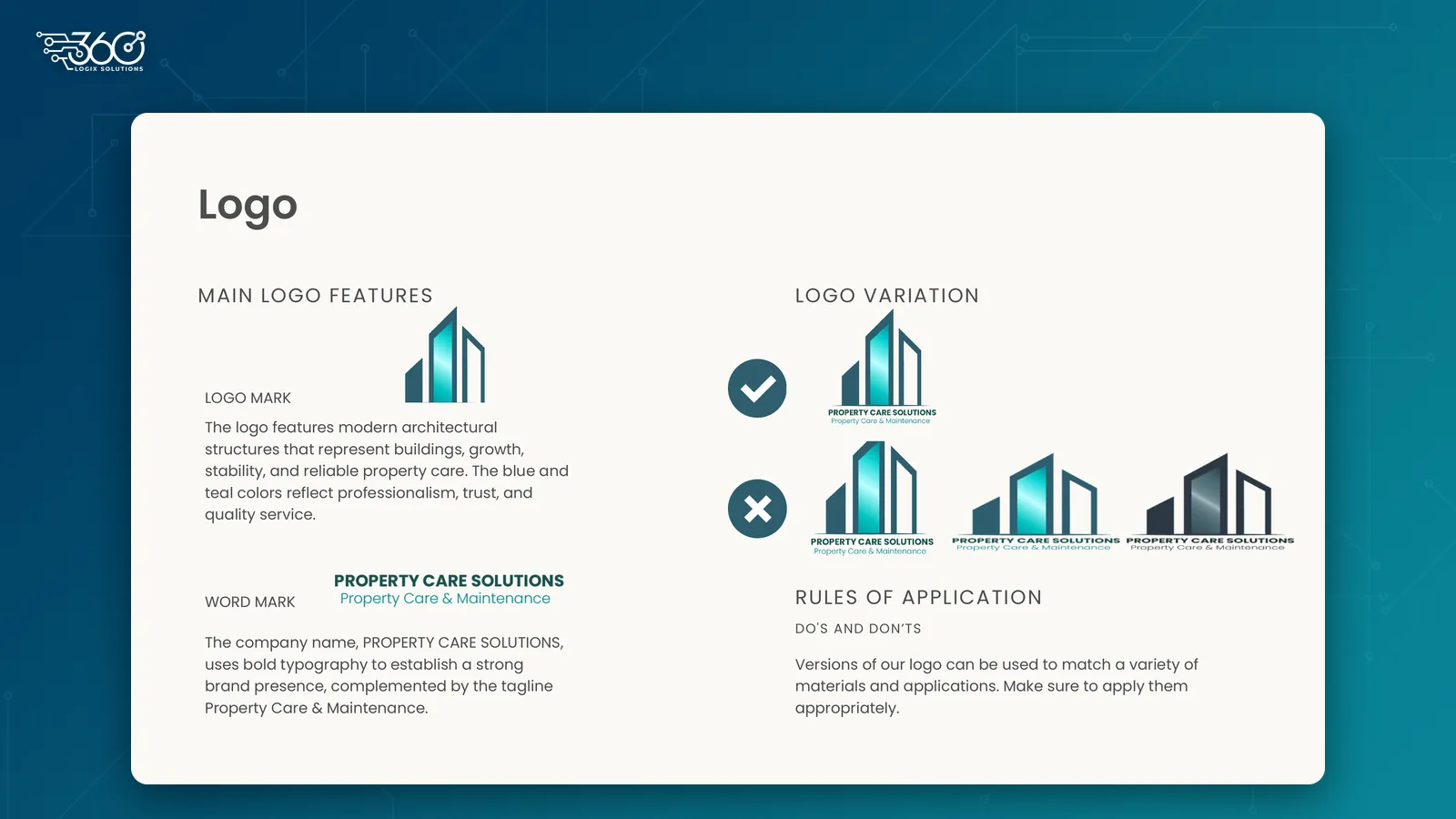
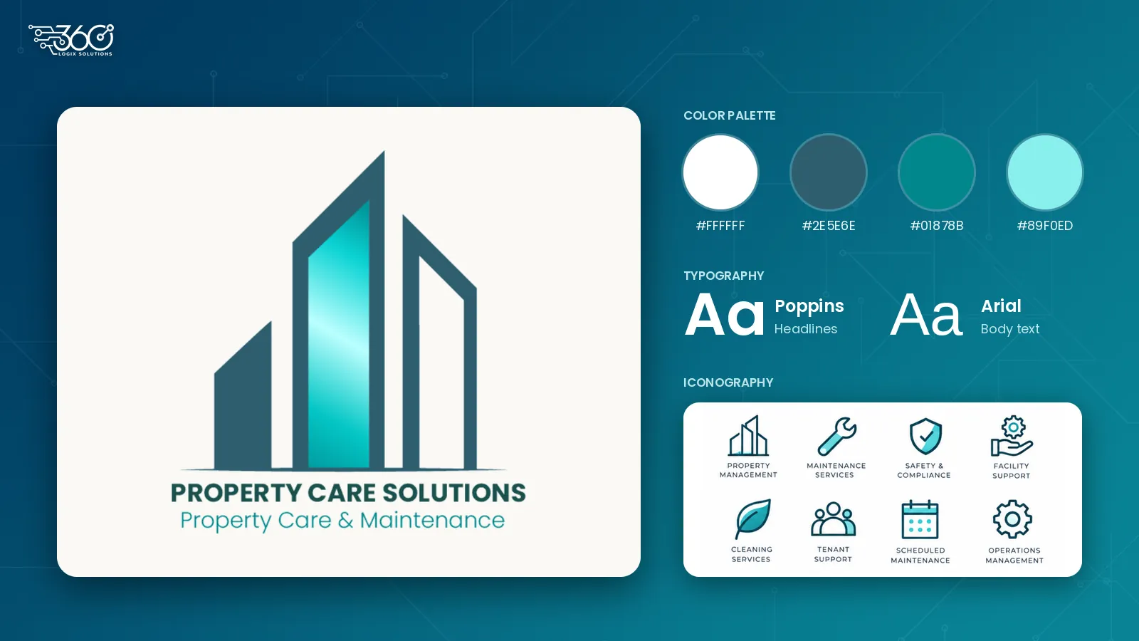
A logo mark built from modern building shapes that stand for growth, stability and reliable property care, paired with a bold wordmark and the tagline “Property Care & Maintenance”.
Versions of the logo for different materials and backgrounds, with clear do’s and don’ts so it’s always applied the right way.
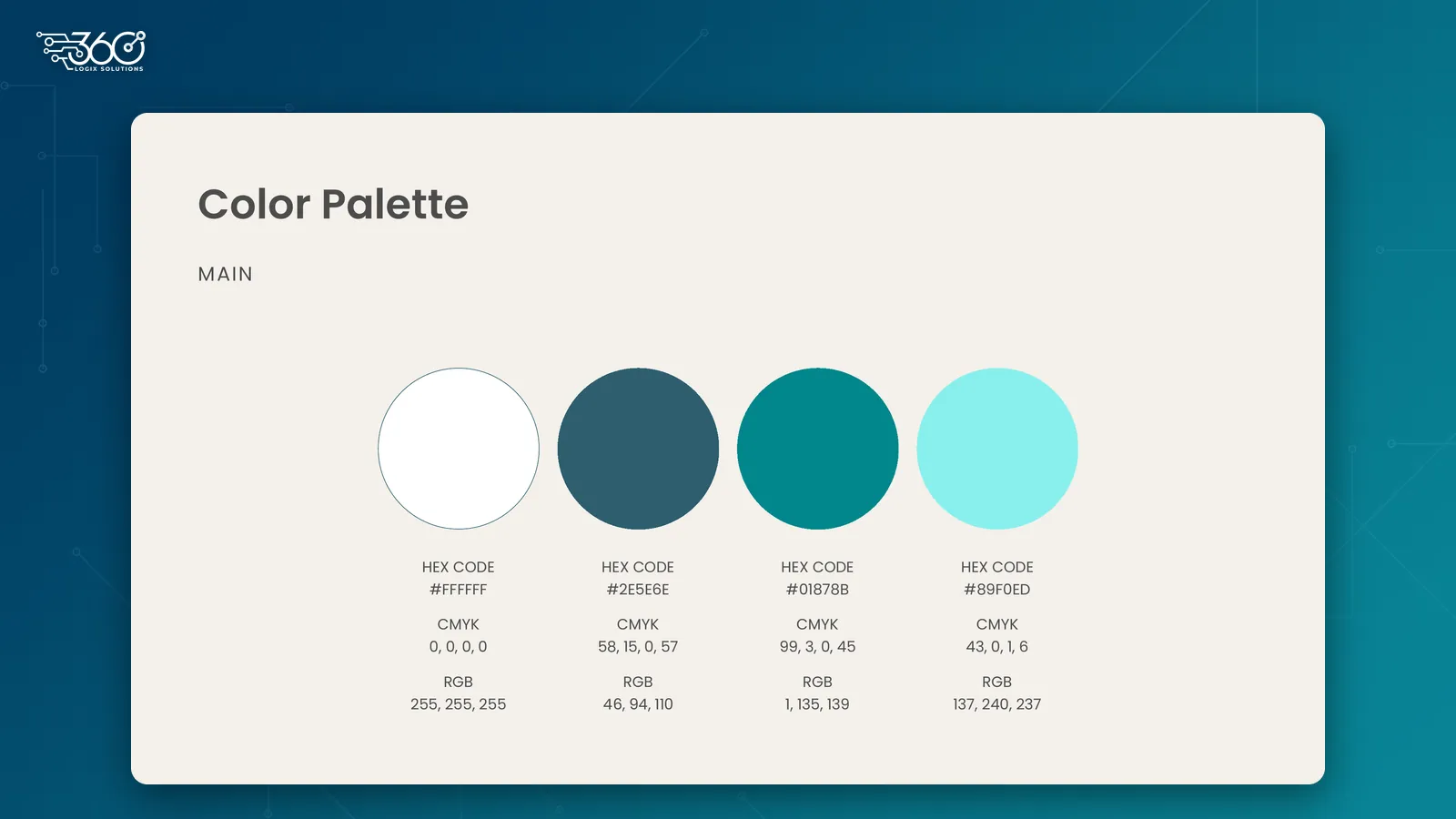
Deep blue and teal for professionalism and trust, a light aqua accent and white, each with its HEX, RGB and CMYK values for screen and print.
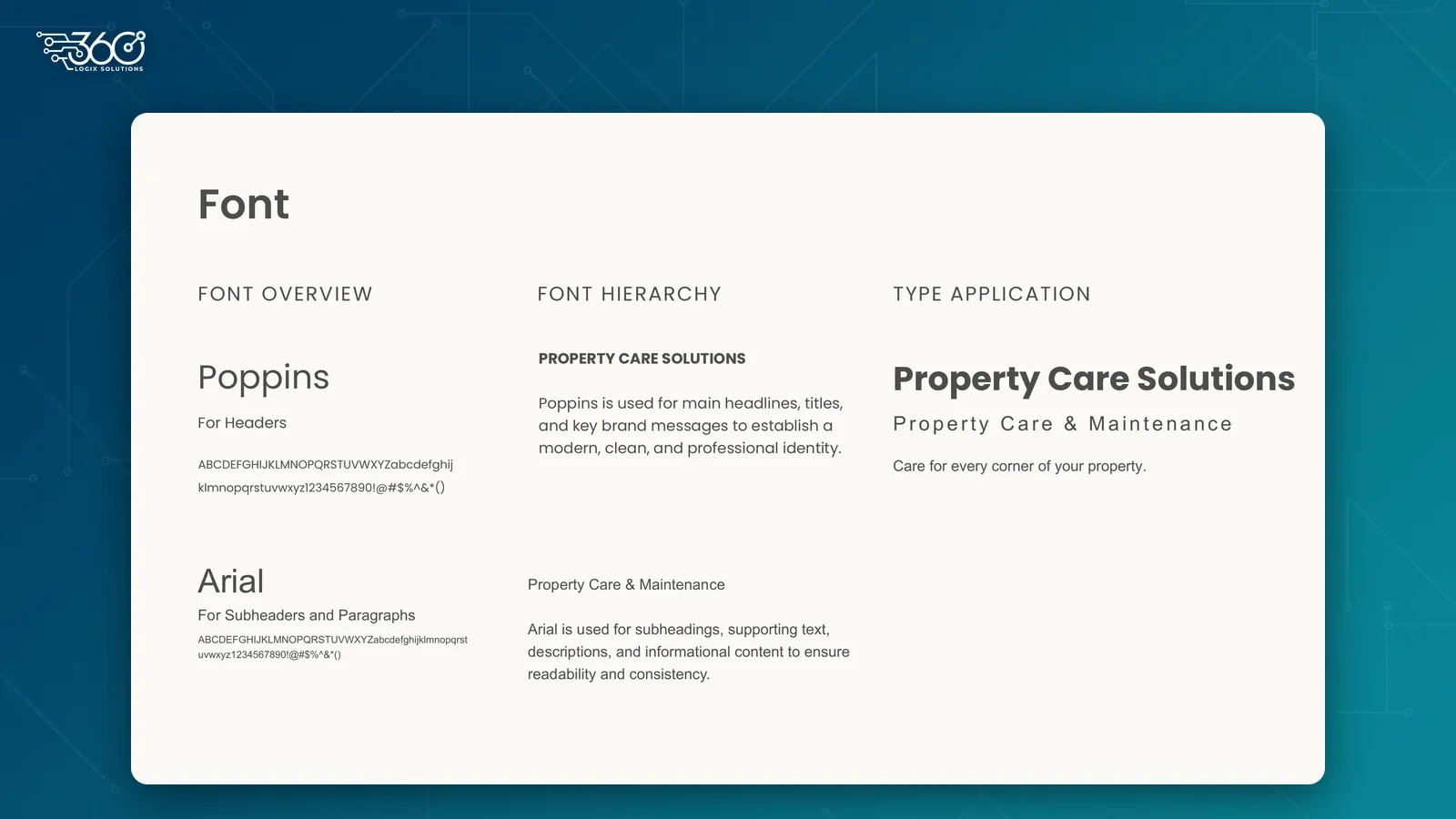
Poppins for headlines and key messages, and Arial for subheadings and body text, with a type hierarchy that shows how they work together.
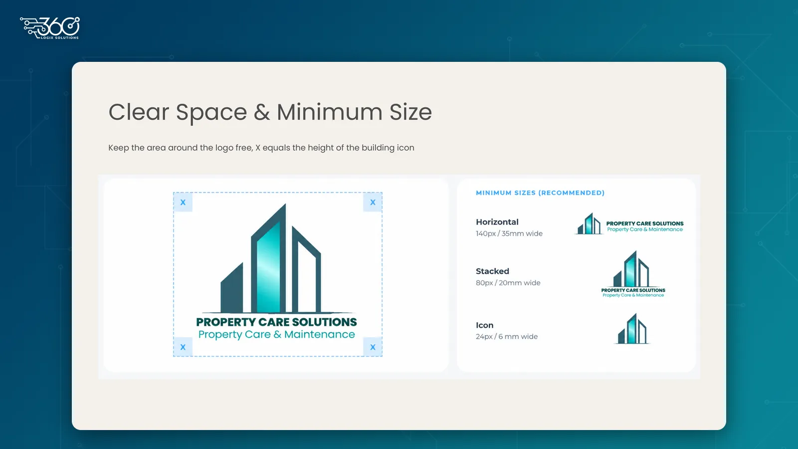
A simple rule for the space around the logo, measured by the height of the building icon, with recommended minimum sizes so it never looks crowded or too small.
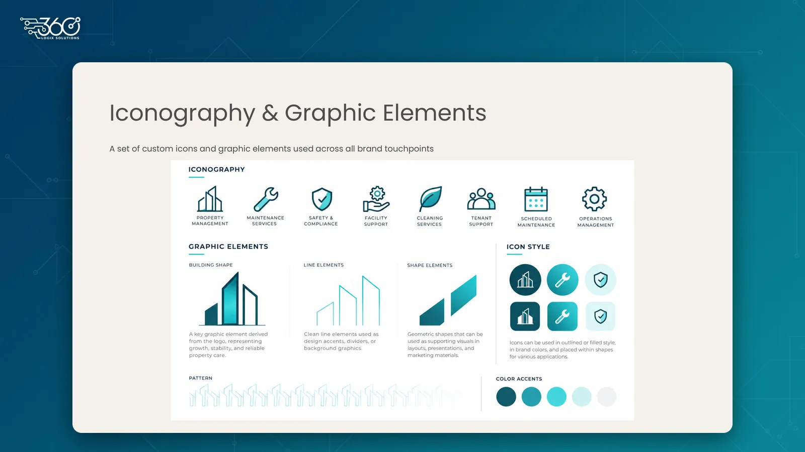
A custom icon set for PCS services, including property management, maintenance, safety and compliance, cleaning, tenant support and scheduled maintenance, plus building shapes, line elements and a pattern for layouts and backgrounds.
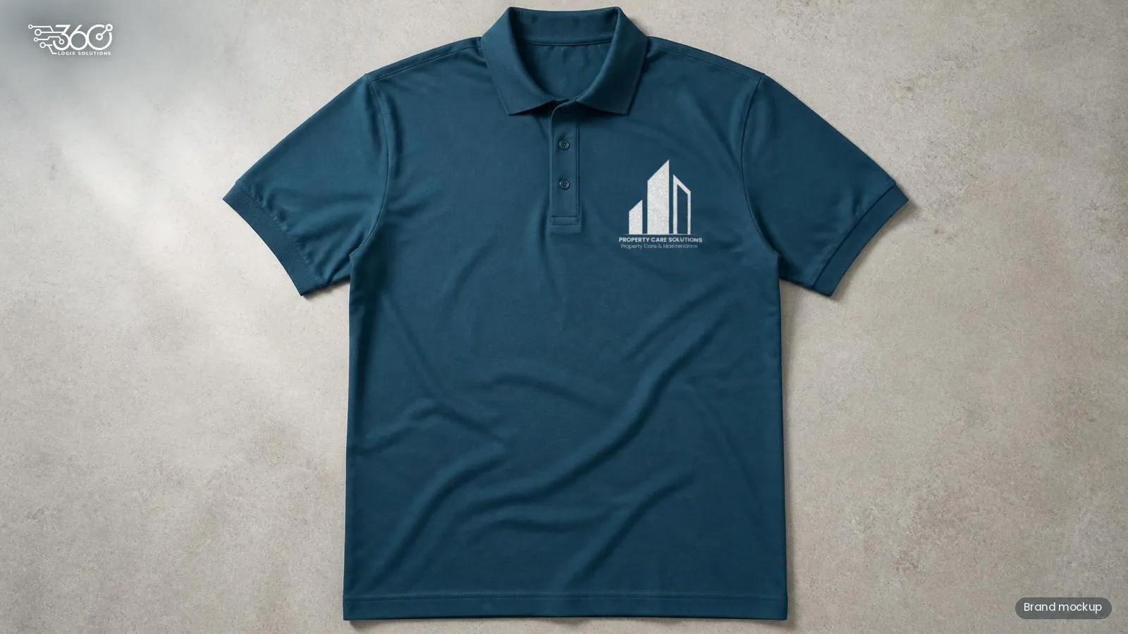
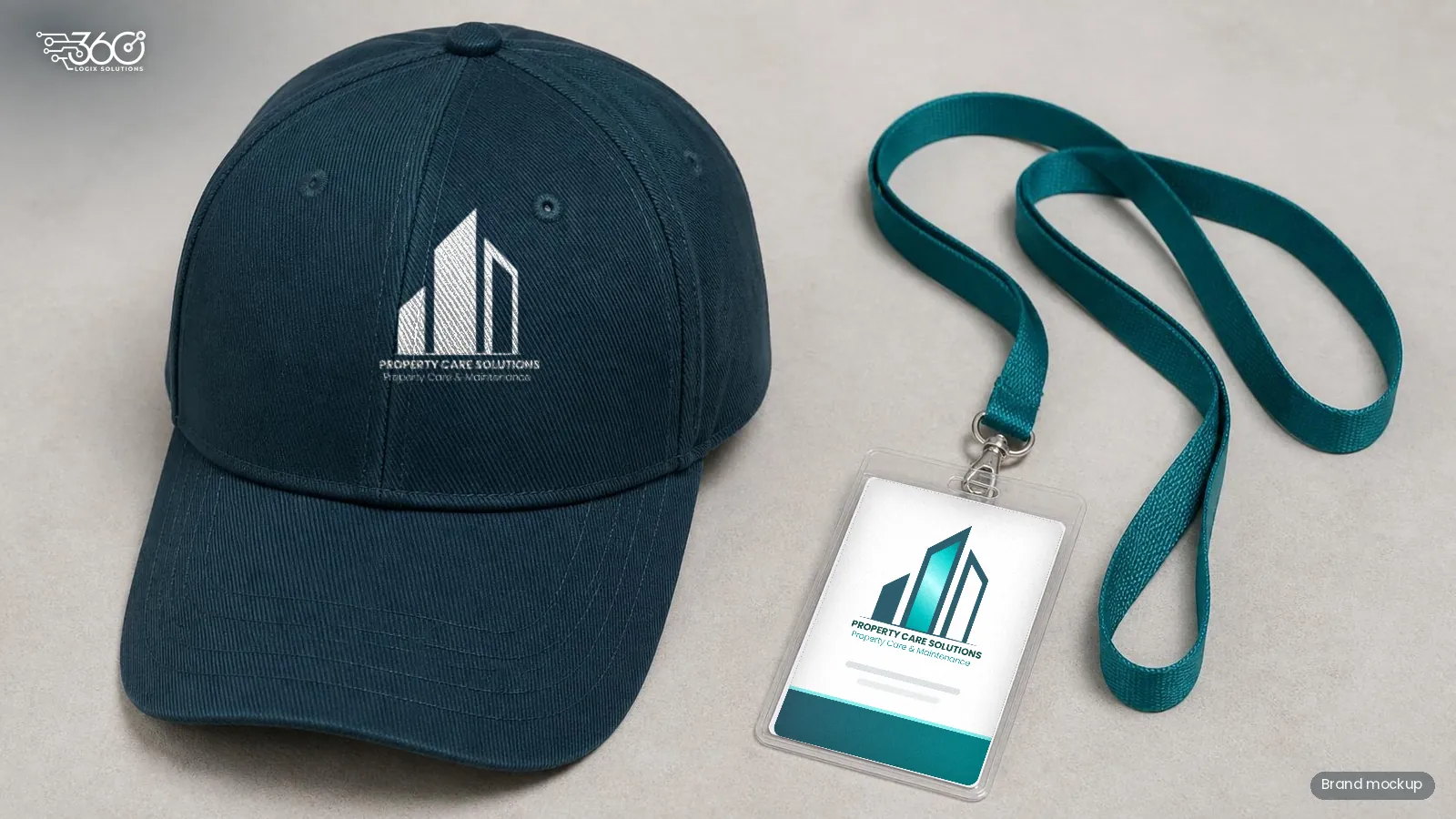
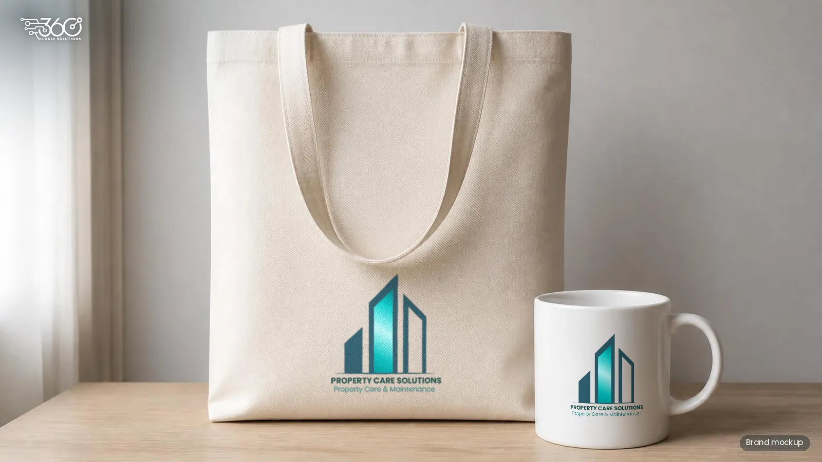
Mockups that show how the PCS logo could look on a polo uniform, cap, ID lanyard, mug and tote.
We design logos and brand kits that your team can use with confidence, from the first sign to the last screen.